#2400: Statistics
Permalink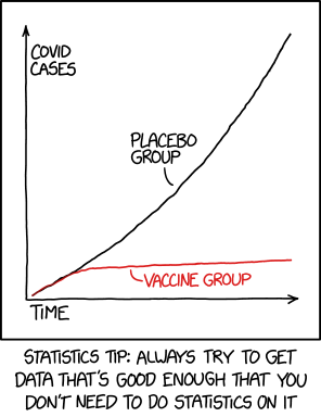
Transcript
[Shown is a graph with the x-axis labeled "time" and the y-axis labeled "COVID cases." There is a black line on the graph labeled "placebo group", which has a roughly linear slope moving toward the top right corner. There is a red line labeled "vaccine group", which follows the black line for about an eighth of the width of the graph before leveling off at a much slower increase.]
Caption beneath the graph: Statistics tip: Always try to get data that's good enough that you don't need to do statistics on it
(Sourced from explainxkcd.com)
Title text:We reject the null hypothesis based on the 'hot damn, check out this chart' test.