#2031: Pie Charts
Permalink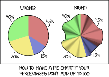
Transcript
[Two colored circles are shown. The circle on the right is warped and bent in shape and shows some shadows from the middle to the outer edges, like a round piece of cloth with wrinkles going out from the center.]
[The left pie chart:]
Wrong:
45% (red)
15% (blue)
30% (yellow)
40% (green)
[The right warped and bent pie chart with shadows:]
Right:
45% (red)
15% (blue)
30% (yellow)
40% (green)
[Caption below the frame:]
How to make a pie chart if your percentages don't add up to 100
(Sourced from explainxkcd.com)
Title text:If you can't get your graphing tool to do the shading, just add some clip art of cosmologists discussing the unusual curvature of space in the area.