#1945: Scientific Paper Graph Quality
Permalink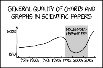
Transcript
[Title above a graph:]
General quality of charts and graphs in scientific papers
[A graph is shown. The y-axis is labeled "bad" at the origin and "good" near the arrowhead at its top. The x-axis is a timeline labeled with each decade from the 1950s to the 2010s.]
[The graph has a mostly positive slope, except that it makes a deep U shape from the early 1990s (perhaps 1993) through around 2015. This portion has a grey background and is labeled the "PowerPoint/MSPaint era".]
(Sourced from explainxkcd.com)
Title text:The worst are graphs with qualitative, vaguely-labeled axes and very little actual data.